
How to build a model to predict Titanic survival?
Using the Kaggle Titanic Disaster dataset


Note: $python -m ipykernel install --user --name=my-virtualenv-name
This above command is needed to activate the virtual env from the wsl inside the visual studio code.
Step 1. Data Collection :
Identify and acquire the data you need for Machine Learning.
Collect the data for the Titanic dataset, we can download the files from the kaggle website for the same. As training data, we have 892 training examples. Each training example is a person who was aboard the titanic when it sunk. Each person has a variety of features, and a target: if the survived (1) or not (0).
- SibSp - siblings or spouse
- Parch - children or parents
Import the data into a python DataFrame. Use the pandas library to do it.
 # bring in the library
 import pandas as pd

 # load the data into a dataFrame object
 data = pd.read_csv('train.csv')
Step 2. Data Exploration :
Understand your data by describing and visualizing it.
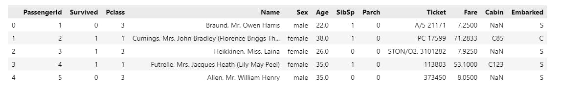
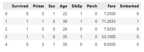
# this displays the top 5 rows
data.head()
Drop the columns that are irrelevant and unnecessary.
data.drop(["Ticket", "Cabin", "PassengerId", "Name"], axis=1)
Get an understanding of the dataset at hand, use info() method to examine the Non null count and Dtype i.e data type for each of the columns in our dataset.
data.info()
data.dtypes # checking data type for all the columns
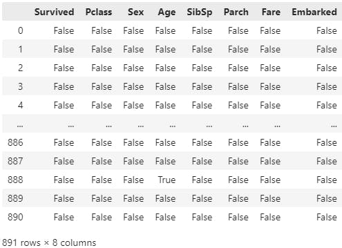
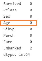
Now we need to detect missing values in our datset,
# this gives out a bool for all the items in the dataset
data.isna()
# an overall picture of how many items are null
data.isna().sum()
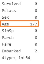
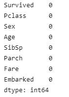
age and embarked have null values. So replace age NaN with the mean value of the age table.
fillna() replaces Null values with a specified value.
# replace missing values in 'Age'
data["Age"] = data["Age"].fillna(data["Age"].mean())
Similarly fill in the missing values for the 'Embarked' Column too, this time use the mode() method.
embarked_mode = data["Embarked"].mode()
data["Embarked"].fillna(embarked_mode.values[0], inplace=True)
Run data.isna().sum() again, there are no null values.
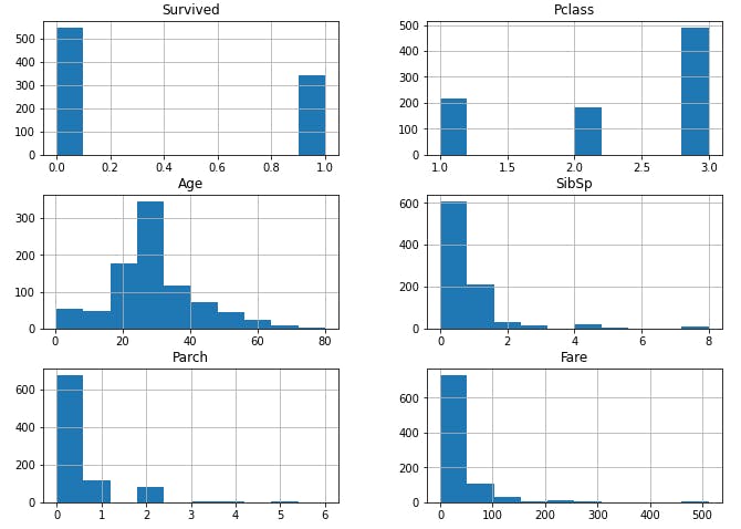
Run data.hist(figsize=(11, 8)) to visualize the data
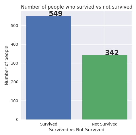
Visualize the number of people who lived and those who were unfortunate.
# compare the number of people survived vs not survived
survived = data[data.Survived==0].count()[0]
not_survived = data[data.Survived==1].count()[0]
text = ["Survived", "Not Survived"]
label = [survived, not_survived]
plt.style.use('seaborn')
plt.figure(figsize=(9,7), dpi=100)
for i in range(0, 2):
    plt.bar(text[i], label[i])
    plt.text(text[i], label[i], str(label[i]), fontsize=17, fontweight='bold')
plt.title("Number of people who survied vs not survived")
plt.xlabel("Survived vs Not Survived")
plt.ylabel("Number of people")
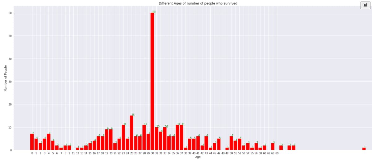
Visualize the survival rate of people based on age,
# find survival rate based on age
data.Age = data.Age.astype(int)
ages = data[data.Survived==1]["Age"].sort_values()
dict = {}
for age in ages:
    if age not in dict.keys():
        dict[age] = 1
    else:
        dict[age] += 1
plt.figure(figsize=(25,10))
key = list(dict.keys())
value = list(dict.values())
for i in range(len(key)):
    plt.bar(key[i], value[i], color="red")
    plt.text(key[i], value[i], str(value[i]), color="green")
plt.xticks(np.arange(len(key)), key)
plt.title("Different Ages of number of people who survived")
plt.xlabel("Age")
plt.ylabel("Number of People")
plt.show()
Observe that 30-40% of people between 25 to 35 age group had a higher survival rate. Chances of survival decline after the age of 40.
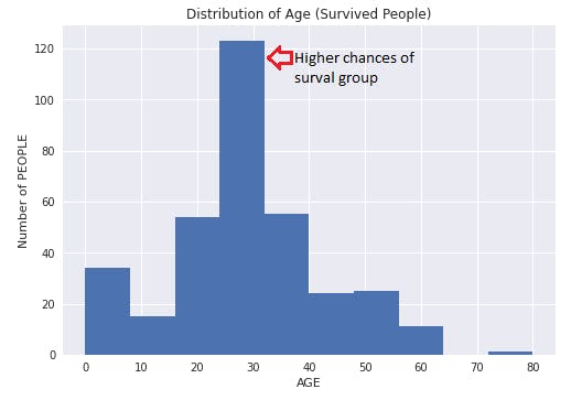
Find the Distribution of Age,
data[data.Survived==1]["Age"].hist()
plt.title("Distribution of Age (Survived People)")
plt.xlabel("AGE")
plt.ylabel("Number of PEOPLE")
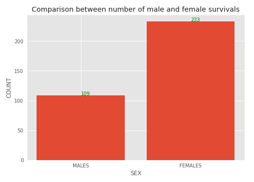
Now compare survival rate among the sexes,
males = data[(data["Survived"] == 1) & (data["Sex"] == "male")]["Sex"].count()
females = data[(data["Survived"] == 1) & (data["Sex"] == "female")]["Sex"].count()
value = [males, females]
labels = ["MALES", "FEMALES"]
plt.bar(np.arange(len(value)), value)
for i in range(len(value)):
    plt.text(i, value[i], str(value[i]), color = "green")
plt.xticks(np.arange(len(labels)), labels)
plt.title("Comparison between number of male and female survivals")
plt.xlabel("SEX")
plt.ylabel("COUNT")
plt.style.use("ggplot")
plt.show()
Females have a higher chance of surviving
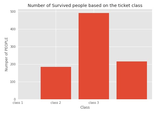
Check the survival criteria based on class
class1 = data[data.Pclass == 1].count()[0]
class2 = data[data.Pclass == 2].count()[0]
class3 = data[data.Pclass == 3].count()[0]
classes = [class1,class2,class3]
plt.bar(data.Pclass.unique(), classes)
plt.xticks(np.arange(3),["class 1","class 2","class 3"])
plt.title("Number of Survived people based on the ticket class")
plt.xlabel("Class")
plt.ylabel("Numper of PEOPLE")
plt.show()
Step 3. Data Preparation :
Modify your data so it is suitable for the type of Machine Learning you intend to do.
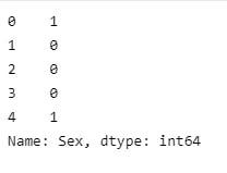
Next replace strings such as "male" and "female" in the sex column to make things easier,
data["Sex"] = data["Sex"].replace({"male":1, "female":0})
data.Sex.head()
Replace the Embarked column values which are in alphabet set to numbers.
print(data.Embarked.unique())
# Outputs
# ['S' 'C' 'Q']

# replace it with numbers
data["Embarked"] = data["Embarked"].replace({"S": 0, "C":1, "Q":2})
Run data.head()to verify the updates,
# convert continuous features to Categorical features.
data["Age"] = pd.cut(data["Age"].values, bins=[0, 3, 17, 50, 80], labels=["Baby", "Child", "Adult", "Elderly"])
data["Fare"] = pd.cut(data["Fare"].values, bins=3, labels=[0,1,2])
Run data.head()again to verify the updates,
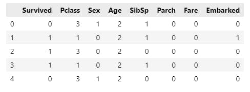
We have converted all categorical values to numeric. This will help the ML algorithms perform more reliably.
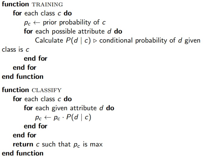
Step 4. Modeling :
Apply a right Machine Learning approach that works well with the data we have.
Use Bayes theorem,
way of finding a probability when we know certain other probabilities.

Drop target column 'Survived'